
Do you spend hours crafting the design of your Web Story only to find that it does not quite display right on older devices or on the biggest phones? It can be tricky to develop content in a portrait-based aspect ratio and make it look great across devices. So to make testing easier, today the Web Story Team is releasing a tool that shows you the major design breakpoints of your Stories. Simply add #development=1 to the end of any Web Story’s URL to access the Web Stories Dev-Tools. This additional markup will create a new portal to analyze your Stories before publishing them. You can test it on this example Story.

Web Stories Dev-Tools
With the support of dev-tools, you can check your Story against a variety of devices and platforms, you can also check for valid AMP documents inside the tool, and access a curated list of resources to get started with Stories. The main feature is a Preview tool for your Story, where you can visualize exactly how it will look on multiple mobile devices, so your design gets tested on the most common surfaces. It will help you catch design inconsistencies in your Story that you wouldn’t be able to see otherwise from the editor view of your tool of choice.

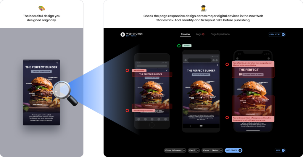
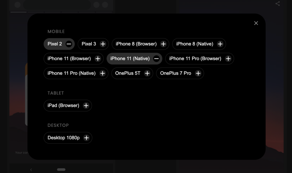
While there are thousands of phone models out in the wild we carefully chose a selection of devices to preview the most common screen sizes, aspect-ratios and platforms. You can even preview your Story on common tablets and desktops if it supports landscape mode.

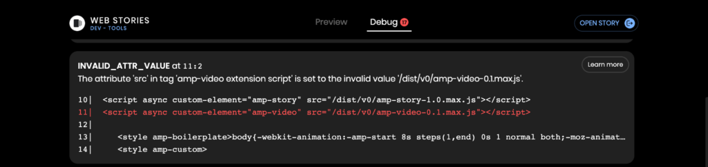
For developers that craft their Stories using traditional web development workflows, we also surface validation errors on the Debug tab. Make sure to fix all errors before publishing your Story.

Common layout issues in Web Stories
Web Stories often run into the following common issues on different phone sizes:
- Key text is cropped in on smaller screens
- CTAs or tap targets are cropped or obscured
- Shapes and images are deformed by changes to aspect ratios
- Line breaks in text are misplaced
- Background and foreground elements do not line up properly
Immersive Experience for All
Whether you like reading Web Stories, are interested in creating them yourself, or are building creation tools, do share your ideas and suggestions with the Web Stories working group. You can reach out to us on Github, Slack and can subscribe to a low traffic developer preview email group.
Posted by Ryan Warrender, Web Stories Product Manager, Google